

COLOUR MATCHING FLOWERS WITH YOUR FURNITURE
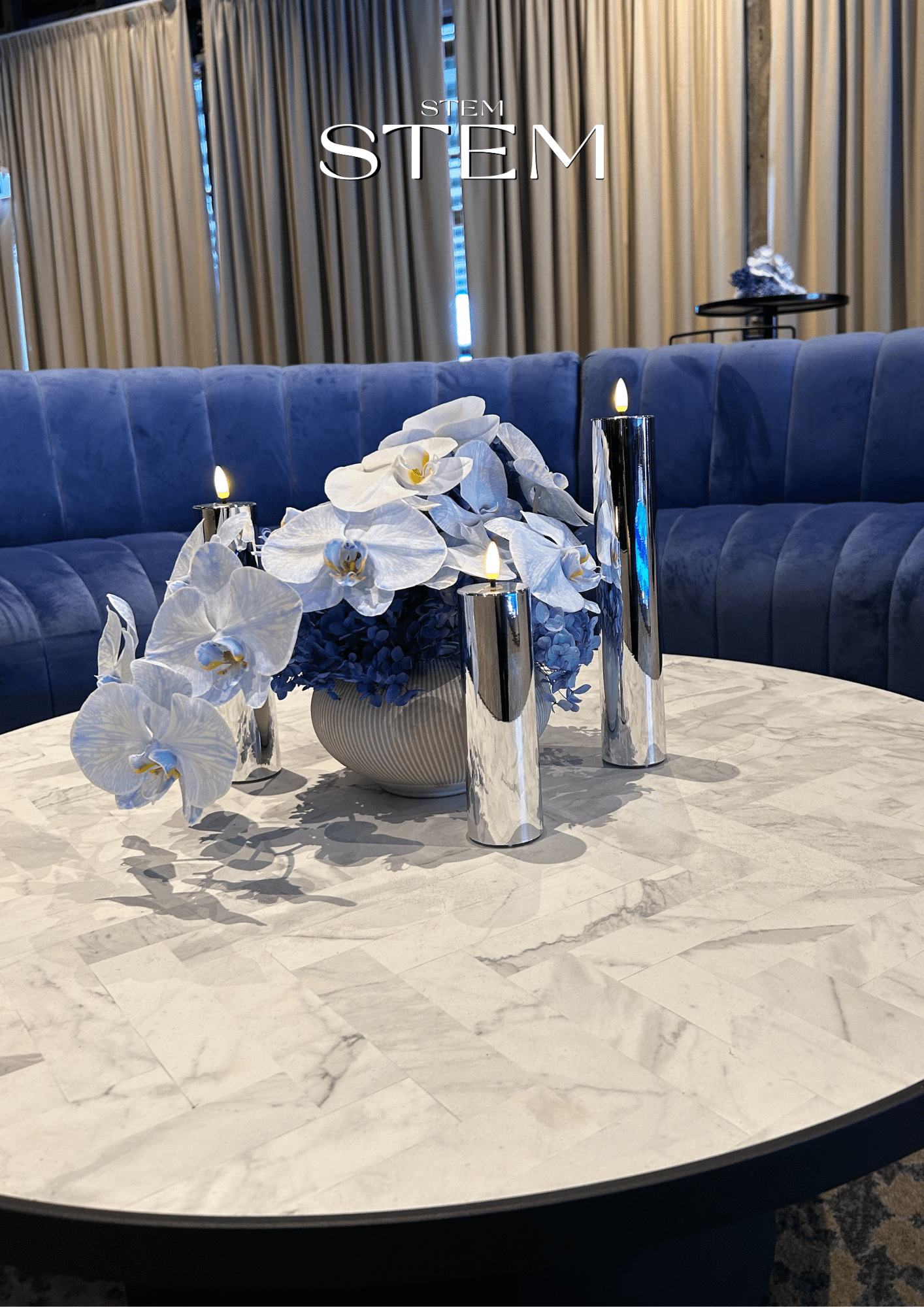
Floral styling is more than just arranging pretty blooms — it’s about creating harmony in a space. One of the most overlooked aspects of event floral styling is how flowers interact with your furniture. Whether you’re planning a wedding, a corporate launch, or a private event, the right floral colours can either blend in beautifully or boldly stand out — depending on what effect you want to create.
At STEM DESIGN, we understand how to strike the perfect balance between floral elegance and interior design. As your go-to event florist in Brisbane, we’re here to help you match (or intentionally contrast) your blooms with your surroundings for maximum visual impact.
WHEN TO MATCH: SUBTLE, LUXURIOUS STYLING
If your event space features a rich colour palette — like emerald green velvet lounges, walnut timber tables, or soft beige linens — consider echoing those tones with your florals. This approach brings cohesion and understated luxury.
Examples of what works well:
- Terracotta sofas + rust-toned orchids, burnt orange roses, and bronze leaves
- Cream or white furniture + soft blush and peach florals for a romantic touch
- Olive green seating + sage-toned foliage with muted pinks and creamy whites
Matching colours create a sense of unity and flow — ideal for weddings and formal settings where harmony is key. It’s an approach our Brisbane wedding florist team often uses for timeless ceremonies and corporate events.
WHEN TO CONTRAST: MAKE YOUR FLORALS POP
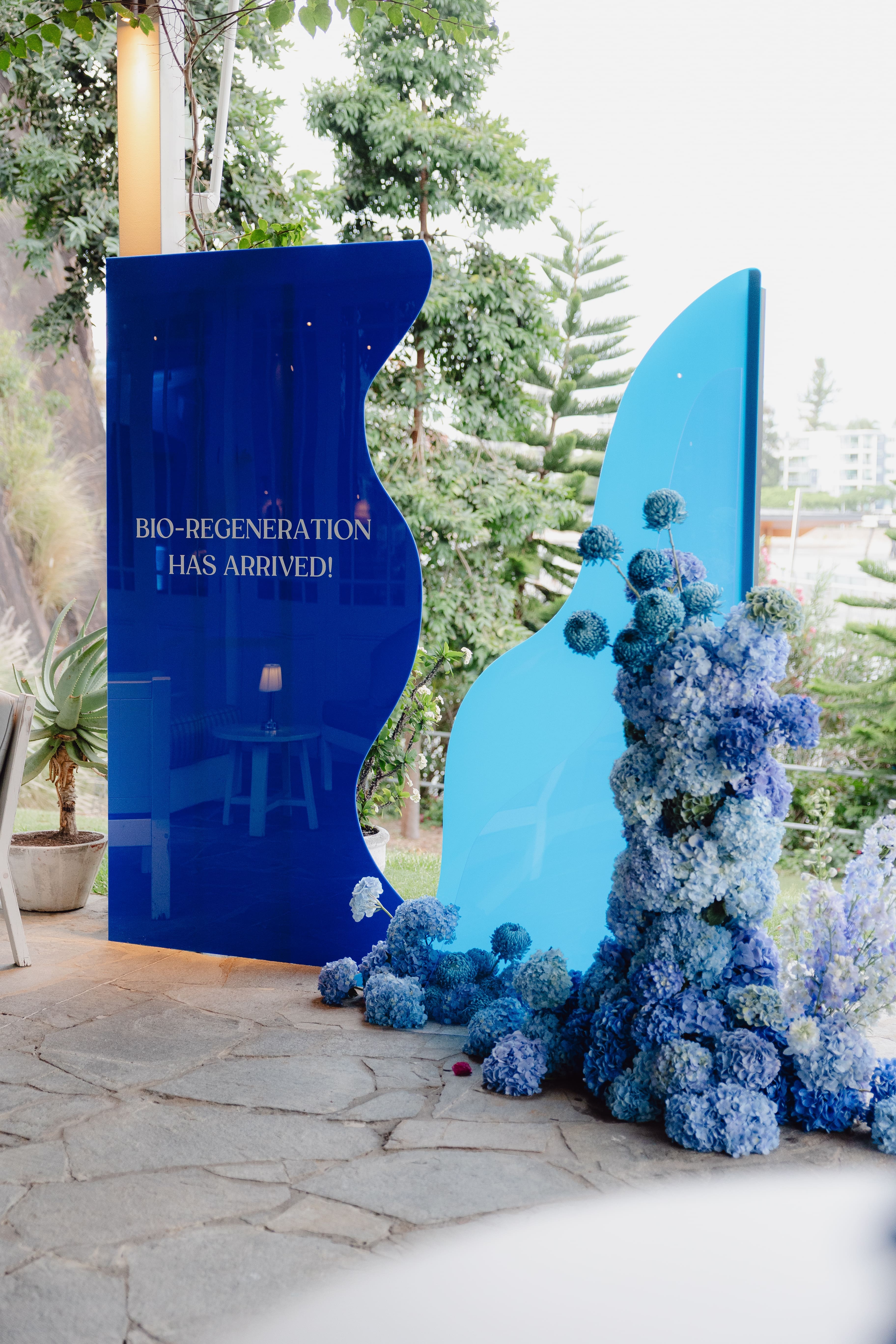
Sometimes, doing the opposite works better — especially if you want your flowers to become a talking point. Contrasting floral tones can bring vibrancy and drama into neutral or dark-toned spaces.
Examples of high-impact contrast:
- Charcoal lounges + bright fuchsia peonies or yellow billy buttons
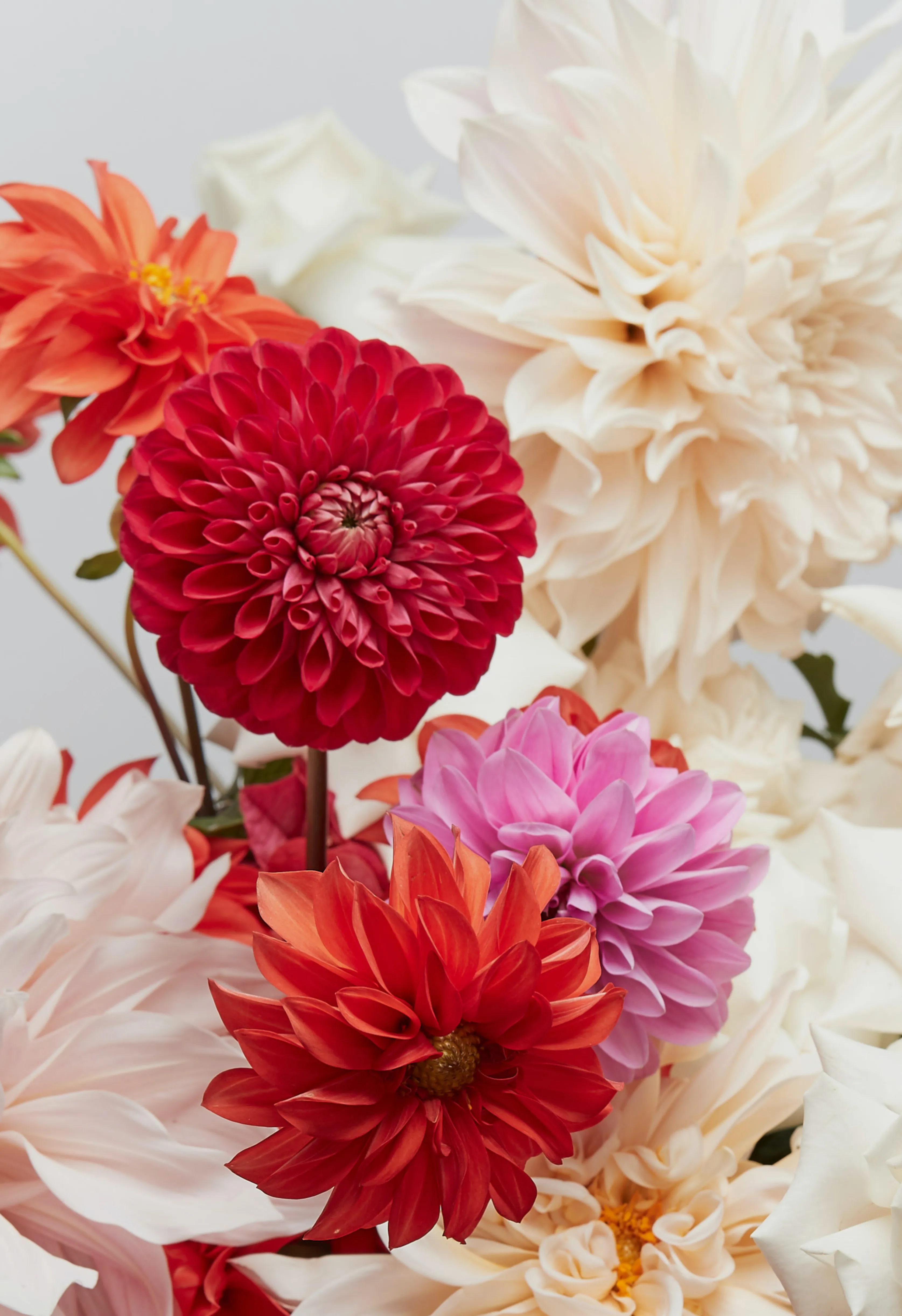
- White linen tables + deep burgundy dahlias or midnight blue anemones
- Neutral or industrial interiors + tropical reds, oranges, and pinks
This technique is fantastic for product launches, gallery events, or modern weddings. As a trusted event florist, we often use contrast to draw focus toward floral installations or table centrepieces, especially in minimalist venues.
COLOURS THAT CLASH: WHAT TO AVOID
Some combinations simply don’t sit well — either because they muddy the colour palette or visually compete with each other.
What to avoid:
- Red florals on red couches – the flowers disappear
- Lime green flowers with brown leather – the tones can feel dated
- Pastels against neons – the softness gets lost in the noise
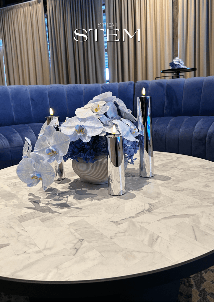
When in doubt, talk to your Brisbane wedding florist or event stylist — we’ll guide you through colour theory and help you avoid common styling pitfalls.
LET’S DESIGN FLORALS THAT FIT — OR STAND OUT
Whether you’re looking for flowers that blend seamlessly or blooms that steal the spotlight, STEM DESIGN offers expert event floral styling across Brisbane and the Gold Coast. We work with your event palette, venue, and personality to create floral magic that leaves a lasting impression.
Get in touch with STEM DESIGN — your leading wedding florist Brisbane clients trust for unforgettable event flowers.


Comments are closed.