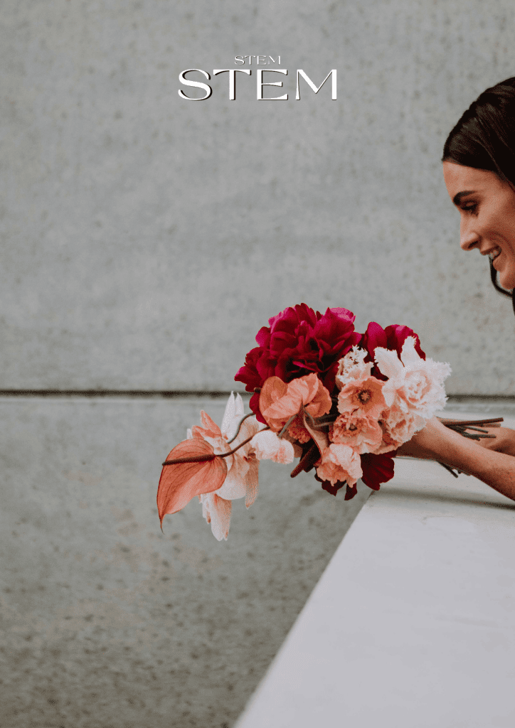
WEDDING FLORALS THAT MATCH YOUR COLOUR SCHEME

Your wedding day is a celebration of love and personal style, and every detail matters—especially the flowers. At Stem Design, we understand that choosing the right wedding florals to complement your color scheme is a fine art. Let’s explore how to select blooms that harmonize beautifully with your event’s aesthetic and avoid potential clashes that could disrupt the overall vibe.
THE IMPORTANCE OF COLOR HARMONY
Flowers have a profound impact on the mood and atmosphere of a wedding. They’re not just decorations; they’re storytellers, conveying emotion and elevating the visual appeal of your special day. Choosing flowers that align with your color scheme ensures that your entire event feels cohesive and intentional.
HOW TO MATCH FLORALS TO YOUR WEDDING
START WITH YOUR PALETTE
Identify your wedding colors first. Are you drawn to soft pastels, bold jewel tones, or neutral hues? Once you have your palette, use it as a guide for selecting your blooms.
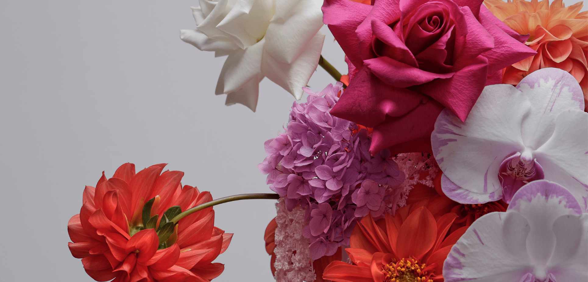
- PASTELS: Opt for peonies, hydrangeas, or lisianthus in blush pink, cream, or lavender shades.
- BOLD TONES: Consider dahlias, ranunculus, or roses in deep red, burgundy, or magenta.
- NEUTRAL PALETTES: White roses, baby’s breath, and eucalyptus create an elegant, timeless look.
USE COMPLEMENTARY COLORS
Complementary colors enhance your palette without overpowering it. For instance:
- If your scheme features navy and gold, sunflowers or white roses with a touch of greenery add balance.
- For pink and peach tones, incorporate coral or ivory blooms to create depth.
CONSIDER SEASONAL FLOWERS
Seasonal blooms are not only cost-effective but also naturally fit the time of year. For example:
- SPRING: Tulips and daffodils in soft hues.
- SUMMER: Bright zinnias and sunflowers.
- AUTUMN: Chrysanthemums and dahlias in warm tones.
- WINTER: Amaryllis and anemones in rich reds and whites.
ADD TEXTURE AND GREENERY
Greenery like ferns, eucalyptus, or olive branches acts as a neutral base that complements any color scheme. Adding textured elements like berries or pampas grass can also tie your floral arrangements together seamlessly.
COLORS THAT CLASH: WHAT TO AVOID
While it’s exciting to mix colors, some combinations can create visual tension and detract from your event’s ambiance. Here’s what to steer clear of:
OVERPOWERING CONTRASTS
Avoid pairing high-contrast colors like neon pink with bright green unless your theme is deliberately bold and eclectic.
TOO MANY SHADES OF ONE COLOR
Using too many shades of the same color can look overwhelming. For example, combining multiple reds without variation can feel flat. Instead, mix in complementary tones like peach or blush.
CLASHING UNDERTONES
Pay attention to warm vs. cool undertones. A warm orange bouquet won’t blend well with cool lavender linens.
IGNORING VENUE DÉCOR
Your venue’s existing décor plays a big role in how colors are perceived. For example, if your venue has deep wooden tones, bright purple arrangements may feel jarring. Opt for warm, earthy florals instead.
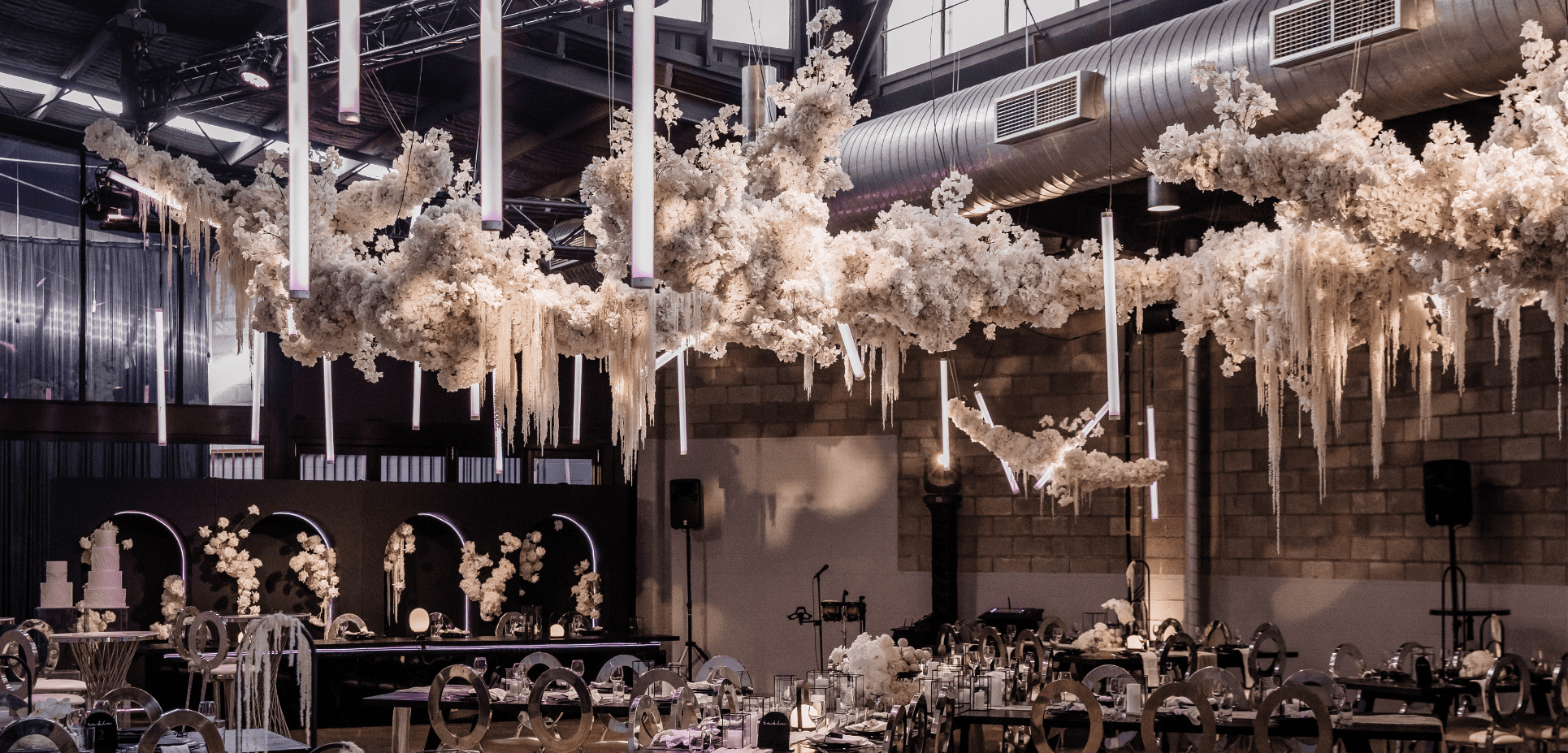
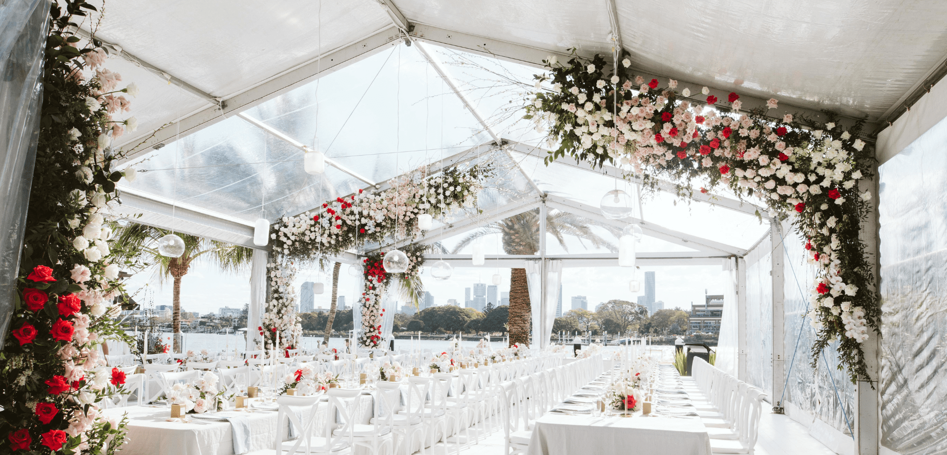
TRUST STEM DESIGN FOR YOUR PERFECT WEDDING
At Stem Design, we specialize in crafting bespoke floral arrangements that align with your vision. Whether you’re planning an intimate backyard wedding or a grand celebration at a luxury venue, our team works closely with you to ensure every bloom complements your color scheme and enhances the atmosphere.
Let us bring your floral dreams to life while avoiding the pitfalls of clashing colors. Contact Stem Design today to book your consultation and discover how we can make your wedding as stunning as it is memorable.

Comments are closed.